Friday 18 February 2011
Evaluation Editing Completed!
Today I finished editing my evaluation for the deadline, and it has been exported to the teacher's digistick for marking. I'm really glad I was able to complete everything by this deadline, as it's been very busy and stressful for the past few weeks, spending most of my free time on it! I will upload a copy of it on here as soon as possible, however I don't have a digistick large enough to hold the file, so once I have found one to use, I can then upload it on here.
Wednesday 16 February 2011
Tuesday 15 February 2011
Evaluation Progress
Well for the past week or so, I've been frantically trying to complete my evaluation, as I was only able to start filming it on Tuesday. However, I have now started editing, so I'm glad I've made quite speedy progress. I was held up slightly, as I wanted to make a few tweaks to my music video, by making sure there was no blank footage at the end, and adding in some video information, as many real music videos have. I wanted to do this on Monday, however, I have had to share a iMac with another group, and when I went to edit, they had beaten me to the computer, so I couldn't edit it until Tuesday morning. I have also been going into school an hour early to get as far as possible with my project, and managed to complete my evaluation filming on Wednesday morning, and have been editing since. I've almost finished editing the first question fully, including screen shots etc. but I think I will first make a rough cut, of all the talking parts, and then edit the questions, opening titles and screenshots etc. in afterwards, so if I do happen to run out of time, the content will still be there.
Thankfully, the deadline has been lengthened, as it's been very stressful trying to complete it fully, so the half term will be a welcome break, but it is a shame I can't do any editing in the holiday, as I don't have the equipment. But hopefully a week away from it will mean I can complete it quickly when I return, and possibly give me a fresher perspective. :)
Thankfully, the deadline has been lengthened, as it's been very stressful trying to complete it fully, so the half term will be a welcome break, but it is a shame I can't do any editing in the holiday, as I don't have the equipment. But hopefully a week away from it will mean I can complete it quickly when I return, and possibly give me a fresher perspective. :)
Monday 14 February 2011
Audience Feedback for Music Video
I showed my music video to a large focus group, and got them to write down good and bad points, and this is what they said:
Good Points:
Negative Points/To Improve:
From this audience feedback, I can see that many people agreed on certain ideas about my film, such as the use of bricolage, when I incorporated old children's TV shows, and my use of Stop Motion. I'm quite happy with the positive comments given, as I think they convey the ideas I wanted the audience to interpret, and as many agreed, I think that shows I have managed to appeal to my younger audience, in a broad, direct way.
The negative comments seem to be quite varied, and it seems there are more, but I think as they are so different, that is just different peoples taste, as they all liked many points within it, so the negatives were not as evident, or negative. Also there is some contradiction, as many people liked the Bricolage, yet I had a few negative comments about the Bricolage, so this just shows how different people's opinions were. I know there was a lot of Stop Motion used, but it was a Stop Motion video, so that is why there was so much, as well as this, I chose it to be concept, as it was this format, so the comment about a lack of narrative, music videos can be Performance, Concept or Narrative, and I incorporated a little performance into my concept video.
I looked at the lip syncing as I had a few negative comments, but after watching it many times and seeing if I could adjust it, I concluded that it was simply my singer's mouth movement that makes it seem like it is out of time. As we filmed it, the song was playing loudly, and the actor sang perfectly in time with it, as it can be heard on the original un-muted clip, but my actor, naturally doesn't open his mouth a lot when speaking, so when singing, it seems like it could be slightly out, when in fact, it is just his lack of mouth movement. When filming I could've tried to change this, by getting him to open his mouth more, however at the time, when hearing the music and him sing, I could tell it was in time, so it didn't seem an issue; as well as this, his singing may have seemed erratic, or unrealistic had he tried, so I think how it is now is best. I do value all this feedback, and have attempted to make changes where appropriate, but this is only a very small, albeit critical audience, as they were all media students, so it is slightly bias, and likely they would pick up on more issues as they are used to analysing music videos. Also I think some of this feedback, may not have taken into account how much I managed to achieve, working alone, I'm aware it is no reason for it to be lesser quality, but to have achieved that music video, with not a huge amount of negative comments really, I am quite happy with.
Good Points:
- Very upbeat, fast pace, fits with the pace of the song, and colourful x3
- Good use of effects x4
- The use of Stop Motion x8
- Visuals represent the music very well, and is fun to watch.
- Nice elements of Bricolage x9
- Sky time lapse was cool x2
- Interesting use of effects to represent his thoughts and feelings.
- Good timing - Cutting on the beat x4
- Theme of 'Kids' shown well.
- I liked the end, when the crayons spelt out 'Kids' and 'MGMT'
Negative Points/To Improve:
- Crayons/Stopmotion overused x5
- Too much use of effects
- Cut stopmotion exactly on the beat, perhaps increase the amount of frames per second to make the transitions smoother.
- More performance, to stop him looking disjointed x6
- Confused by performance.
- Lip syncing was often completely out x2
- Some of footage I hadn't made x2
- Didn't feel like a music video.
- Too slow at the start getting into it.
- Too many shots.
- Camera moves a bit in animation.
- No sense of real narrative.
From this audience feedback, I can see that many people agreed on certain ideas about my film, such as the use of bricolage, when I incorporated old children's TV shows, and my use of Stop Motion. I'm quite happy with the positive comments given, as I think they convey the ideas I wanted the audience to interpret, and as many agreed, I think that shows I have managed to appeal to my younger audience, in a broad, direct way.
The negative comments seem to be quite varied, and it seems there are more, but I think as they are so different, that is just different peoples taste, as they all liked many points within it, so the negatives were not as evident, or negative. Also there is some contradiction, as many people liked the Bricolage, yet I had a few negative comments about the Bricolage, so this just shows how different people's opinions were. I know there was a lot of Stop Motion used, but it was a Stop Motion video, so that is why there was so much, as well as this, I chose it to be concept, as it was this format, so the comment about a lack of narrative, music videos can be Performance, Concept or Narrative, and I incorporated a little performance into my concept video.
I looked at the lip syncing as I had a few negative comments, but after watching it many times and seeing if I could adjust it, I concluded that it was simply my singer's mouth movement that makes it seem like it is out of time. As we filmed it, the song was playing loudly, and the actor sang perfectly in time with it, as it can be heard on the original un-muted clip, but my actor, naturally doesn't open his mouth a lot when speaking, so when singing, it seems like it could be slightly out, when in fact, it is just his lack of mouth movement. When filming I could've tried to change this, by getting him to open his mouth more, however at the time, when hearing the music and him sing, I could tell it was in time, so it didn't seem an issue; as well as this, his singing may have seemed erratic, or unrealistic had he tried, so I think how it is now is best. I do value all this feedback, and have attempted to make changes where appropriate, but this is only a very small, albeit critical audience, as they were all media students, so it is slightly bias, and likely they would pick up on more issues as they are used to analysing music videos. Also I think some of this feedback, may not have taken into account how much I managed to achieve, working alone, I'm aware it is no reason for it to be lesser quality, but to have achieved that music video, with not a huge amount of negative comments really, I am quite happy with.
Sunday 13 February 2011
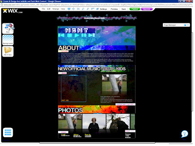
Completed Webpage!
Here's the link to my completed and published website for MGMT:
http://www.wix.com/stephi261/mgmt
I'm really pleased with the result, I have been tweaking certain parts, every time I looked at it, but I feel it is finished now. The changes I have made, include, linking the events page, to another page with events listed on it, and the merchandise advert to a page with t-shirts for sale on it.
When I first "completed" the website, I had links, but only the links to Facebook, Myspace and Amazon, to purchase the single were fully working. But, I decided to included a few other pages, to make the website a little more realistic, and give it slightly more depth than just the homepage.
http://www.wix.com/stephi261/mgmt
I'm really pleased with the result, I have been tweaking certain parts, every time I looked at it, but I feel it is finished now. The changes I have made, include, linking the events page, to another page with events listed on it, and the merchandise advert to a page with t-shirts for sale on it.
 |
| This is the homepage of the MGMT website I created. |
 |
| This is the events page, linking from the events text, on the homepage I found the events on the real MGMT website, so the information included is accurate and working. |
 |
| This is the merchandise page, linking to the "Brand New Merch Here" link on the homepage. The merchandise on here, I created using a basic t-shirt template, and incorporated the font on the website, forming a link between the two, and ultimately, the band, as this would encourage that font to be a recognisable part of them. |
Friday 11 February 2011
Completed Music Video!
Today I finished the video! So I'm very happy that it is all done now, and that I altered the end result after some feedback I got when I first completed it. Yesterday I had completed it for the first time, but very few others had seen it, at least in full, so I got a group of people that hadn't seen any of it, to give me some feedback, and help me decide what looked good or bad, or needed altering. The feedback was very helpful, I got a really good response, and the comments I got were all very constructive, and helped me come up with the finished product here.
The positive comments I got, were that they liked the cutting on the beat, and crayons changing colours, the way the crayons and buttons made a flower shape, and at the end spelled the name of the song and band out. I especially like that comment, as it was part of Goodwin's six, to make the band clear in the video, so although I only had a short amount of footage of the singer, the clips at the end worked to make sure they were aware. They also liked the time lapse sky shots I included, that change colours, the brightness and colourfulness of the video was also a common part people liked, as well as the use of children's TV clips and the graphic match from the singers face to buttons and a crayon. I was really pleased with all the positive feedback, especially as it was the first completion, so, there wasn't too much to change.
The criticisms that were made about the video, were that I should use a specific "indent" effect more on the crayon images, as it was the most liked effect. However, a big part of my feedback, was that I should use more effects on the crayons, to stop them becoming a bit monotonous, this really helped my video I think, so I'm happy with the new dimension it gave to the stop motion. There was also a mention of some of the movement not being quite on the beat, which was due to the slight changes i'd made throughout, which added up, but I managed to fix them, so this was fixed. Those were really the only parts that the audience felt needed changing or altering, so I am very happy there were so few, and that I agreed and could change them easily.
This is the video, however there is around 4 minutes of black screen at the end, as I exported it before cutting the track where parts had been moved, lengthening it, I will cut it again.
Tuesday 8 February 2011
Audience Feedback on Digipak
Today, I showed a group of 7 peers the digipak I have created, to see what they thought of it. I showed it to them, after they had seen the video, so I could find out if they thought it seemed appropriate and related to the song and video. The response I got to it, was mostly positive, which I was happy with, there were only a few features that one person really didn't like, however, I have to allow for individual differences and preferences. The two favourite images were the button on the inside. and the picture of the singer also on the inside. They liked the foreground not being of the band, but showing they were there, and thought it matched the feel of the band. The back image was also very popular, but not really for any specific reason, they just seemed to like how it looked. The front cover however, caused some controversy. One person thought it was too empty, and could have more on it. I can see where they are coming from, but I wanted my front image to be quite striking, and I think the bright letters on the front give the impression, and attract attention, I believe in this case, less is more, but I am appreciative of their comments. Also the other comment was that, I feature crayons throughout my music video, but nowhere on the digipak, which was a fair point. I hadn't thought to put them on it, and it is a good idea, but from analysis of other digipaks, there isn't always a link between the video, they can often not feature anything that was in it, so I was unsure of what to make of that comment.
Some other comments, that I have now acted on, were that the colour of the track names on the back didn't look quite right. I was unsure about it too, so the audience feedback helped a lot, as I changed it to black, and has improved it I think. There was also a comment that I could add some information about the band, like who plays what instruments, which is a common feature on digipaks. I agreed with this comment, and added a small amount of information, and now think it is complete. The finished digipak can be seen in the blog post above.
Some other comments, that I have now acted on, were that the colour of the track names on the back didn't look quite right. I was unsure about it too, so the audience feedback helped a lot, as I changed it to black, and has improved it I think. There was also a comment that I could add some information about the band, like who plays what instruments, which is a common feature on digipaks. I agreed with this comment, and added a small amount of information, and now think it is complete. The finished digipak can be seen in the blog post above.
Monday 7 February 2011
Completed Digipak!
Here is the image of my completed digipak:

I explained about any other changes I have made to this in the blog post below, but overall, I am very pleased with the finished product, and think it correlates with the video well.
Also here is an image of physical version of the Digipak that I constructed:

I explained about any other changes I have made to this in the blog post below, but overall, I am very pleased with the finished product, and think it correlates with the video well.
Also here is an image of physical version of the Digipak that I constructed:
 |
| Front and back cover -however these were the original images used, before my audience feedback, so the text on the back cover is all black, and on the inside left, there is some more text, but this is illustrated above. |
 |
| Front Cover |
 |
| Inside left and right |
 |
| Inside Right |
 |
| Inside Left |
Friday 4 February 2011
Webpage Progress
Today I chose to complete the webpage as much as I can, but I still need to upload the video to the page, so have not published it yet. Here is a picture of the progress I have made so far:
 I am very pleased with the progress I have made, all that I need to do to this now, is insert some text relevant to the band, a few more photos to flick through, and the actual music video, once this is done the website will be complete.
I first started this page with this basic template:
 As you can see, comparing this to the webpage I have created, you can see I changed the fonts, so the band name, has a retro feel to it, as much of MGMT's music and artwork is styled like. I thought this would be good as it creates a kind of recognisable feature, that can be related with the band. I then changed the other fonts, to a slightly softer rounder style, as I thought this suited the page and band more. I moved a lot of the gadgets on the page, and got rid of some, as they weren't what I wanted to include, however most of them, were just in the wrong place, so I moved them to where I wanted them. I then uploaded some of the photos I took at the photo shoot, to get an idea of how they look, and will add more soon. Finally, I changed the image in the background to this picture made on adobe:
 There were a few other backgrounds that I was choosing between, as the colour changed slightly when I uploaded it, and I wasn't sure of the texture. But after swapping it several times, I liked this background the most, as although it was vibrant, as it was the background, and behind a light layer, it didn't look to intense, and the texture added a new dynamic to the website, making it more aesthetically pleasing.

I first started this page with this basic template:


Thursday 3 February 2011
Digipak Progress...

Wednesday 2 February 2011
Digipak Images
The digipak is nearly complete now, all the images are in place, and some of the text, all I need to complete it now, is put the band and song title on the spine and it should be finished. I will post a picture of the completed design on here, and hopefully and image of it made into the actual product. However, due to lack of time, I intend to finish the webpage and make good progress with my evaluation, before I physically make it, to ensure I get everything done, and additional features can be added if I have time.
 This image will be behind where the CD sits, fitting the same shape, (the right hand panel) as I showed in my design ideas, I'm very happy that it turned out exactly like my design.
 This will be the front cover, of the colourful fridge magnets, also as I drew in my design, I'm happy this turned out how I had imagined too - the picture is slightly cropped on my front cover, so there isn't too much blank space.
 This photo will be on the inside left panel, with the lyrics on the left side of the picture. I chose this photo, from the photoshoot we had, as I thought it represented the singer quite well, showing they don't want to be the main focus, but are still present, much like the video. I also think it creates a sense of ambiguity, possibly encouraging the buyer to find more out about the band, boosting their promotion. I used this photo instead of the one I took that had the singer with a button where his eye is, as the placement wasn't quite right, so the wording wouldn't fit comfortably, and I just felt this picture suited the album more. The other picture, that I drew in my designs, will be feature somewhere on the website.
 Finally, this photo is on the back of the single, this is also slightly cropped, and has the track information on the top left corner, and copyright info. on the bottom left corner with a barcode. I like this picture, as it's very simplistic, but looks quite striking and intense, almost. It is also essentially identical to the picture in my idea, which I think is good.


Subscribe to:
Posts (Atom)